01 · Foundation
Getting started
Keep Goodkind unpublished while you configure it. This lets you work with real store data and share the preview without changing the live storefront.
Install the theme
- In Shopify admin, open Online Store → Themes.
- Add the Goodkind ZIP to your theme library using Shopify’s theme upload/import action.
- When processing finishes, open Goodkind with Customize. Do not publish it yet.
Make the first pass
- Open Theme settings and set the logo, favicon, fonts, colors, layout width, and controls.
- Configure the Header and Footer section groups.
- Open the Home page template, connect collections and products, then replace demo imagery and copy.
- Use the template selector to review product, collection, search, cart, page, blog, article, contact, about, password, and 404 templates.
- Preview on desktop and mobile. Test navigation, product variants, add to cart, search, localization, and app blocks before publishing.
Shopify’s preview action provides a private preview link for an unpublished theme. Recheck the storefront while signed out so customer-facing behavior is represented accurately.
02 · Global controls
Theme settings
Global settings create the shared visual system across every template. In the theme editor, select Theme settings rather than an individual section.
- Brand
- Set a text logo or upload a logo image, choose the uploaded-logo mode, adjust logo width, and upload a favicon. Goodkind also supports bundled fallback assets used by its preview package.
- Typography
- Choose Shopify-hosted heading and body fonts, adjust the overall type scale, and select the heading letter case.
- Layout
- Control the maximum page width, desktop side margin, mobile side margin, and global section spacing.
- Colors
- Configure background and text plus primary, secondary, sage, mist, and ochre surfaces. Separate values cover borders, buttons, and button text.
- Shapes and controls
- Adjust card and control corner radii, border width, optional card shadows, and uppercase button labels.
- Product cards
- Show vendor names, reveal a second image on hover, display color swatches, and enable quick add.
- Cart
- Choose drawer or page cart behavior and decide whether customers can add an order note.
- Motion
- Enable or disable the theme’s subtle reveal motion. Reduced-motion preferences remain important when evaluating storefront movement.
- Social media
- Add optional Instagram, TikTok, Pinterest, Facebook, and YouTube URLs. Empty profiles are not shown.
After adjusting colors, review text and controls over every surface color. Merchants are responsible for keeping custom color combinations readable.
03 · Store navigation
Header
The Header combines the brand, primary navigation, search, customer account entry, cart access, mobile menu, and localization controls.
Settings and navigation
- Use main menu connects a Shopify navigation menu selected in the section.
- Accessible menu label provides a meaningful name for assistive technology.
- Sticky header keeps navigation available while scrolling.
- Navigation link blocks can point to Home, Catalog, About, Contact, or a custom URL. When using the main menu, its nested links also drive the mobile navigation.
Utility controls
Search opens the predictive-search interface. The customer account control appears only when customer accounts are enabled for the shop. Cart access opens the cart drawer or links to the cart page according to the global cart setting. Country and language selectors appear only when more than one relevant market or language is available.
05 · Page building
Homepage sections
Add sections through the Home page template in the theme editor, then drag them into the intended order. The following list reflects Goodkind’s actual section schemas.
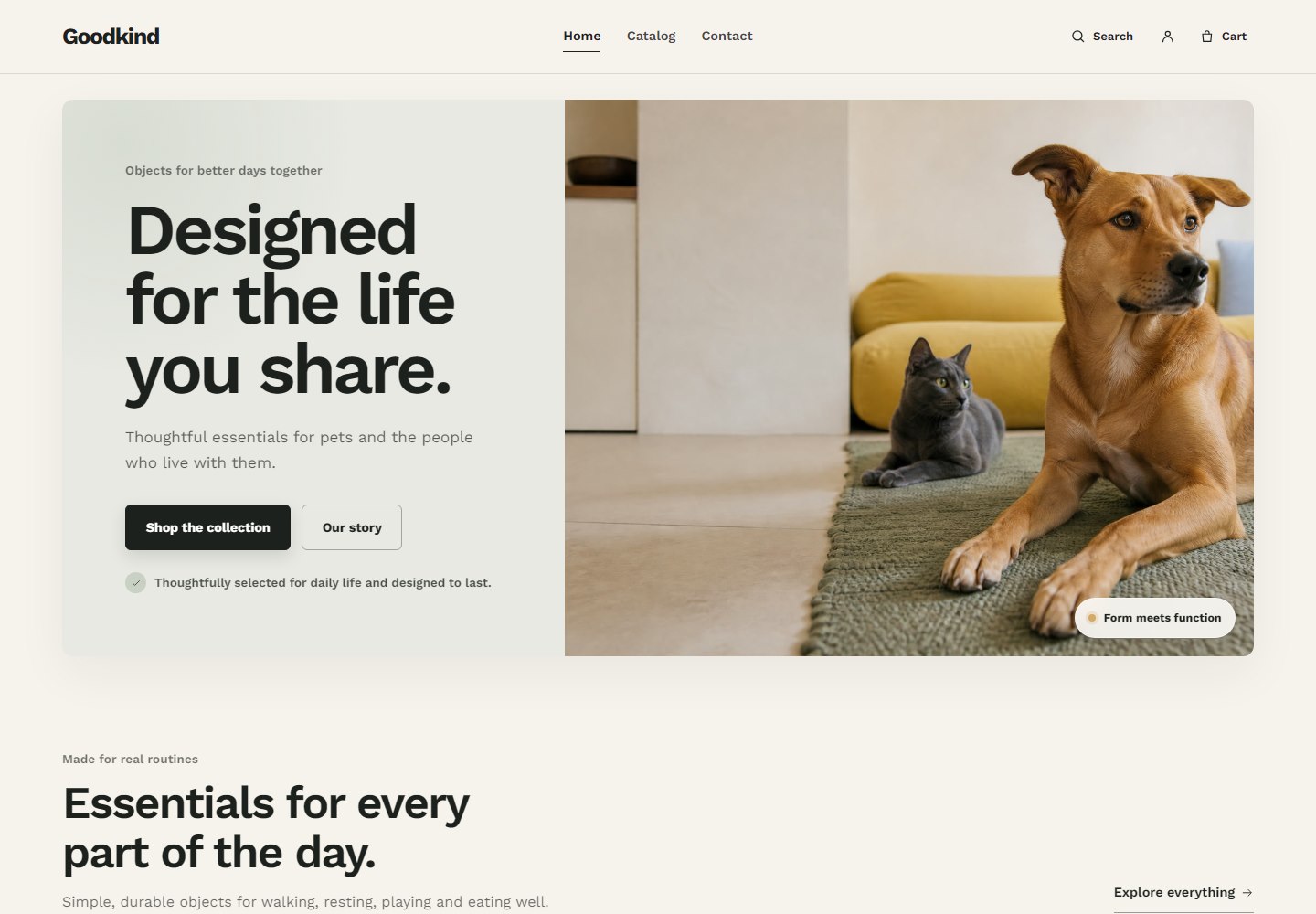
Hero
Use for: the primary storefront message. Upload separate desktop and mobile images, set image position, eyebrow, heading, rich text, two optional buttons, supporting note, and image badge. Keep the heading concise and use the mobile image when the desktop crop hides the subject.
Collection list
Use for: browsing a small set of product categories. The section has eyebrow, heading, text, and an optional section link. Each Collection block can connect a collection, override its image and position, replace the label and supporting text, and use a custom destination.
Featured collection
Use for: a product-led row or grid. Connect a collection, choose background and image ratio, set the number of products, and optionally show a custom-labeled collection link. Product card behavior follows global product-card settings.
Image with text
Use for: brand story, materials, or an editorial transition. Select an image and focal position, reverse the layout when needed, then add eyebrow, heading, text, and one optional button.
Benefits
Use for: a compact set of service or product principles. Set the section intro, then add Benefit blocks with an icon, heading, and text. Keep the statements specific and verifiable.
Announcement bar
Use for: short, rotating store notices. Choose its color style, rotation interval, and accessible label. Message blocks contain the announcement text and optional link. Avoid putting essential policy detail only in a rotating message.
Slideshow
Use for: a small number of campaigns that need equal prominence. Configure the accessible label, autoplay, and slide interval. Each Slide supports desktop and mobile images, position, overlay, text color, content placement, copy, and buttons. Autoplay can be paused through the section controls.
Rich text
Use for: a focused message without media. Add eyebrow, heading, rich text, alignment, and an optional primary or secondary button.
Full-bleed campaign
Use for: a high-impact image or hosted Shopify video. Configure image/video, autoplay, controls, overlay strength, text color and position, copy, and one button. Use controls for video with meaningful audio and avoid autoplaying distracting content.
Featured product
Use for: selling one product in page context. Select the product, optional editorial image, media label, layout, and color. Blocks include eyebrow, heading, price, description, benefits, variant picker, quantity, buy buttons, Custom Liquid, and compatible app blocks.
Shoppable image
Use for: a styled scene with direct product discovery. Add one image and section introduction. Each Product hotspot connects a product, accepts a custom label, and uses horizontal and vertical position controls. Check every hotspot on mobile after positioning.
Product comparison
Use for: comparing two clear options. Set the background, intro, and column labels. Each Comparison row includes a feature, a value for each column, and optional check icons. Use short entries so the table remains readable on small screens.
Testimonials
Use for: genuine customer feedback. Set the background and introduction, then add Customer quote blocks with quote, customer name, and context. Only publish feedback you have permission to use.
FAQ
Use for: concise pre-purchase answers. Configure background, intro, and an optional button. Question blocks contain the question and rich-text answer.
Logo strip
Use for: approved press, retail, certification, or partner marks. Add the section heading and Logo blocks with image, alternative text, and optional URL. Do not use marks without permission.
Blog posts
Use for: recent editorial content. Connect a blog, set intro copy, choose how many posts appear, enable excerpts when useful, and add an optional blog link.
Newsletter
Use for: Shopify customer email signup. Choose the section color, add eyebrow, heading, text, button label, and a short note such as consent or content expectations.
Video
Use for: product demonstration or brand storytelling. Add intro copy and use either a Shopify-hosted video or supported external video URL. Autoplay and loop are configurable; provide controls and context appropriate to the content.
Apps and Custom Liquid
The Apps section is a container for compatible Shopify app blocks and can include section spacing. The standalone Custom Liquid section renders merchant-supplied Liquid and also includes a spacing control. Review the security note in Apps & Custom Liquid before using it.
06 · Merchandising
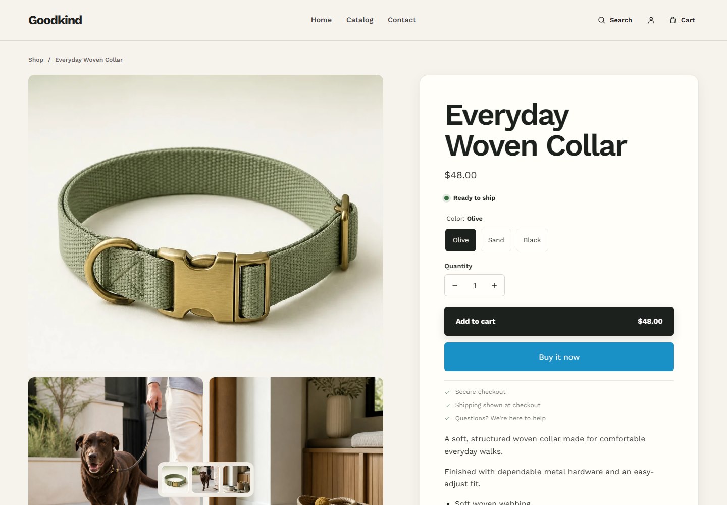
Product pages
The Product information section controls gallery layout, media fit, thumbnail navigation, sticky product information, and the mobile sticky add-to-cart action. Reassurance lines and preview fallback images are also configurable.
Product information blocks
- Core details
- Vendor, heading, price with unit pricing, SKU, custom text, inventory status, description, divider, share link, and collapsible information.
- Variants and swatches
- The Variant picker renders product options and disabled values. Native Shopify swatch images or colors appear when the block’s swatch setting is enabled and swatch data exists on the product option.
- Purchase options
- The Purchase options block shows one-time and selling-plan choices when the product has selling plan groups. Quantity and Buy buttons are separate blocks; dynamic checkout can be enabled in Buy buttons.
- Pickup availability
- The Pickup availability block lists enabled locations and pickup timing for the selected variant when Shopify returns store availability.
- Gift cards
- Gift-card products show optional recipient email, name, message, and delivery-date fields within the product form.
- Personalization
- A Personalization field block creates a line-item property using text or multiline input and can be required.
- Extensions
- Compatible app blocks and a product-level Custom Liquid block can be placed among native product information blocks.
Recommendations
Add the Product recommendations section to the product template and choose Related products or Complementary products. Complementary results depend on recommendations configured for the product; the section does not invent products when Shopify returns none.
07 · Catalog
Collection pages
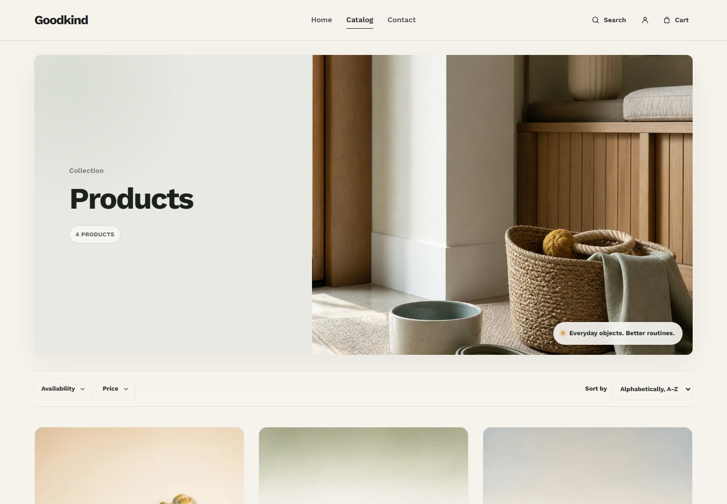
The Collection products section supports a configurable header style, eyebrow, collection description, hero-image fallback, image badge, filtering, sorting, pagination size, desktop columns, and product image ratio.
- The collection title, image, and description come from the collection in Shopify admin.
- Enable filtering only after configuring storefront filters in Shopify’s Search & Discovery tools. Availability, price, and other filters come from Shopify’s collection filter data.
- Sorting uses the collection’s available Shopify sort options.
- Product cards follow global vendor, secondary-image, swatch, and quick-add settings.
08 · Discovery
Search
Predictive search
The Header search dialog requests Shopify predictive-search results as the shopper types. It can show query suggestions, up to four products, pages, articles, and a link to all results. On smaller screens, the layout reduces the amount of supporting content to keep products readable.
Search results
The Search results section has editable heading and introductory copy, filtering, sorting, results-per-page, and image-ratio controls. When no query has been entered, optional Browse link blocks can lead to Home, Catalog, About, Contact, or a custom URL.
Search filtering depends on filters available from Shopify. Product, article, and page results are rendered according to their returned resource type.
09 · Checkout path
Cart
Choose Drawer or Page under Theme settings → Cart. Both modes use Shopify’s cart data and support line-item quantity changes, removal, discounts, subtotal, tax/shipping context, and checkout.
- The drawer opens from the header and refreshes after supported product forms add an item.
- The cart page provides a full summary and can show product vendor names.
- Order notes are available in both modes when Allow order notes is enabled.
- Additional checkout buttons can appear on the cart page when Shopify provides them.
Always test changes with multiple products, variants, discounts, and a sold-out item before publishing.
10 · Shopify services
Accounts & localization
Customer accounts
Goodkind uses Shopify’s <shopify-account> component in desktop and mobile navigation. The account control appears only when customer accounts are enabled for the store. Account authentication and customer data remain managed by Shopify rather than by the theme.
Countries, currencies, and languages
The Header mobile menu and Footer render Shopify localization forms when the store has more than one available country or language. The country selector displays the country, currency code, and symbol; the language selector displays available language names.
Configure markets, domains, currencies, languages, and translated content in Shopify admin. The theme displays what Shopify makes available; it does not translate product or page content by itself.
11 · Extensions
Apps & Custom Liquid
App blocks
Goodkind supports compatible Shopify app blocks in the Apps section, Product information, and Featured product. Install and configure the app first, open the relevant template in the theme editor, select Add block, and choose the app block when it is offered.
If an app block is unavailable, confirm the app exposes a theme app extension for that template and that the app is installed on the current store. Some apps also require their app embed to be enabled under Theme settings → App embeds.
Custom Liquid
Use the standalone Custom Liquid section or product Custom Liquid block for small, trusted additions. Liquid runs as part of the storefront render and can affect layout, privacy, performance, or behavior.
12 · Inclusive storefronts
Accessibility
Goodkind includes semantic headings and controls, visible focus treatment, labeled navigation and dialogs, keyboard-operable disclosure patterns, live regions for dynamic search, and reduced-motion consideration. These foundations do not replace merchant review and are not a certification.
- Write meaningful alternative text for informative images; leave decorative image alt text empty where appropriate.
- Keep headings in a logical order and use descriptive link and button labels.
- Check contrast after changing colors and inspect text laid over campaign media.
- Test menus, search, filters, sliders, product options, cart, and forms using only the keyboard.
- Add captions or transcripts for meaningful video and avoid content that flashes.
13 · Storefront health
Performance
Real performance depends on product media, installed apps, custom code, tracking, location, device, and Shopify delivery. No theme can guarantee a particular Lighthouse score.
- Upload images close to their intended aspect ratio and use Shopify’s focal-point tools where available.
- Avoid large animated files and unnecessary autoplaying video above the fold.
- Remove unused app embeds and review the storefront after installing or updating an app.
- Use a limited font family and weight set; every additional font file adds work.
- Keep Custom Liquid and third-party scripts small, trusted, and necessary.
- Measure the published storefront with realistic products and apps, then investigate the largest requests and layout shifts first.
14 · Common fixes
Troubleshooting
An image is cropped unexpectedly
Adjust the section’s image position or product image ratio. For Hero and Slideshow, provide a separate mobile image when one crop cannot preserve the subject at both orientations. Also review Shopify image focal points.
The menu is not showing
In Header, enable Use main menu and select a menu, or add Navigation link blocks. Confirm each linked resource is published to the Online Store channel.
Products are not appearing in a collection
Check product status, Online Store availability, collection conditions, inventory rules, and active filters. Automated collections may take a moment to reflect changed conditions.
Swatches do not appear
Enable swatches in the Variant picker or global product cards. Then configure Shopify swatch color/image data on the relevant product option. Text options without swatch data remain readable option labels.
An app block is unavailable
Confirm the app supplies a theme app extension for the chosen section or template. Reopen the editor after installation, check app embeds, and follow the app developer’s placement instructions.
Changes are not visible
Confirm you edited the correct theme and template, save the editor, then open the preview link in a private window. Check whether the resource is assigned to a different template.
The storefront shows an older theme version
Check which theme is published under Online Store → Themes. Newly uploaded versions are separate library entries; publishing or previewing the intended copy is required.
15 · Quick answers
Frequently asked questions
Can I use Goodkind on more than one store?
Theme usage is governed by the license attached to the Shopify Theme Store purchase. In general, a Theme Store license is associated with the store for which it was purchased. Review Shopify’s current theme licensing terms before using the theme on another store.
Does Goodkind support Shopify apps?
Yes. Goodkind includes app-block locations in the Apps section, Product information, and Featured product. Compatibility still depends on the app’s theme app extension and implementation.
Can I change fonts and colors?
Yes. Heading and body fonts, type scale, heading case, global surfaces, accents, borders, buttons, and text colors are available in Theme settings.
Does Goodkind support multiple languages and currencies?
Goodkind displays Shopify’s available country/currency and language selectors. Configure Shopify Markets, languages, and translations in admin; the theme does not create translations automatically.
Where do I edit the homepage?
Open Online Store → Themes, customize Goodkind, and choose the Home page template. Add, remove, configure, and reorder sections in the editor sidebar.
How do I update the theme?
Add the newer Goodkind version to the theme library and review its templates and settings before publishing. Keep the current published theme as a rollback point while you transfer any required configuration or custom code.
Will an update remove my products or store content?
Products, collections, customers, orders, navigation, pages, and blog content live in Shopify rather than inside the theme ZIP. Theme settings, template arrangements, and code customizations belong to a particular theme copy and may need to be recreated or migrated.
Does Goodkind include product subscriptions?
Goodkind can display selling plans supplied through Shopify and compatible subscription configuration. Creating and managing the plans requires the relevant Shopify or app setup.
Can I add custom code?
Yes, through Custom Liquid and theme code editing. Duplicate the theme first, use only reviewed code, and understand that customizations may require manual work when updating.
Where can I get Goodkind support?
Use the Goodkind Support form for theme setup, bugs, compatibility, and documentation questions. Include the store URL, affected page, reproduction steps, and a screenshot when useful.